Data Exploration
Understand how to explore data using descriptive statistics, frequency tables, and visual tools like histograms and pie charts. Learn measures of central tendency and variability such as mean, median, mode, range, interquartile range, variance, and z-scores to summarize and interpret data distributions for better insights.
We'll cover the following...
Statistics are needed not only to understand data science or machine learning but also to get a sense for the data. Irrespective of domain, statistics are necessary to understand the behavior of data in different situations. Learning more and more about your data is fun. You can find some critical insights that were previously undiscovered.
We can divide statistics into two parts: descriptive and inferential statistics.
Descriptive statistics are the summaries of information that was collected for analysis. These can be done using charts like histograms and pie charts, or with numbers such as the mean, variance, or correlation between data variables.
Inferential statistics observes the data by looking only at a set of points. For example, these statistics could deal with all the taxi drivers working in New York on the basis of the behavior of 100 random drivers’.
Data exploration
Data contains variables and constants. Variables are information that vary by records. Constants have the same values for all records. Variables are useful because they change and offer more insights. The topic of interest is known as a dataset’s cases. Records in data that consists of various variable values are represented as a case. We can present cases and variables as data tables.
Consider the example of taxi drivers in New York. We want to do some analysis and record the data per their driver ID.
| DriverID | Age | Experience | Shift | Car |
|---|---|---|---|---|
| 1022 | 32 | 5 | Day | Sedan |
| 2065 | 35 | 7 | Day | Hatchback |
| 2066 | 39 | 12 | Night | Sedan |
| 2058 | 26 | 2 | Night | Sedan |
In the above table, each record that looks like this is a case:
| 2058 | 26 | 2 | Night | Sedan |
|---|
DriverID, Age, Experience, Shift, and Car are all variables. To analyze the data, we need to convert our data to this format. This will help in further exploration.
Summarize data by frequency table
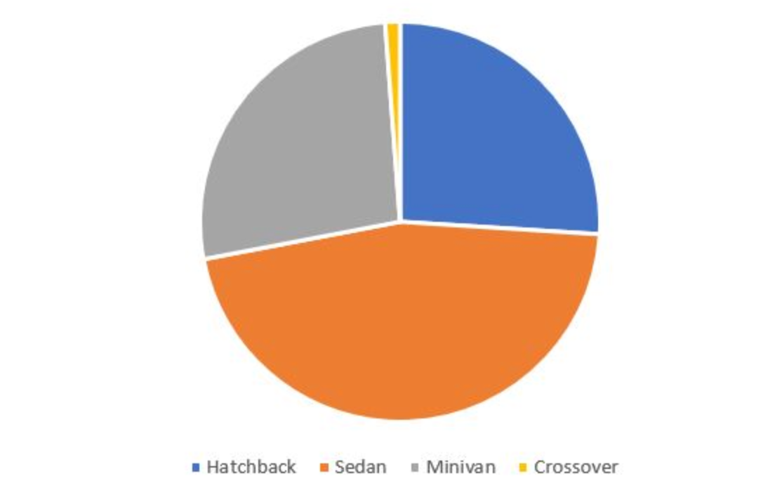
Now, let’s learn about data through a frequency table. Frequency tables are used to understand the frequency of a particular group or variable value. Suppose we want to create a frequency table by car type, like the example below. We have data on 250 drivers for the experiment.
| Car Type | Frequency | Percentage |
|---|---|---|
| Hatchback | 65 | 26 |
| Sedan | 115 | 46 |
| Minivan | 67 | 26.8 |
| Crossover | 3 | 1.2 |
| Total | 250 | 100 |
Frequency variable represent the count of the car type in the complete data table. Percentage shows the percentage value. We can also use frequency tables for continuous variables. However, using them directly does not make much sense. We can bucketize them and use these buckets as the categories.
| Age | Frequency | Percentage |
|---|---|---|
| 18-30 | 98 | 39.2 |
| 31-40 | 85 | 34 |
| 40-50 | 58 | 23.2 |
| 50+ | 9 | 3.6 |
| Total | 250 | 100 |
| Age | Frequency | Percentage |
|---|---|---|
| 18-30 | 98 | 39.2 |
| 31-40 | 85 | 34 |
| 40-50 | 58 | 23.2 |
| 50+ | 9 | 3.6 |
| Total | 250 | 100 |
We can represent this data with a different chart to better show the information. See the example below.
Using a pie chart
Using a bar chart
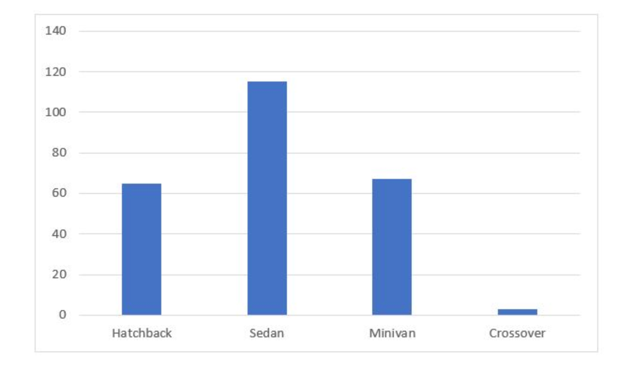
A pie chart is used to show relative percentages. A bar chart is used to show the count of categories.
Bar charts and pie charts are good for representing frequency tables. For continuous data, we can also use histograms.
Using histograms
Quiz: Frequency table
Consider the following frequency table.
| Salary | Participants |
|---|---|
| Below $10,000 | 56 |
| $10,001-$25,000 | 72 |
| $25,001-$50,000 | 89 |
| $50,001-$75,000 | 75 |
| $75,001-$10,0000 | 36 |
| More than $10,0000 | 19 |
What is the percentage of people earning a salary less than $10,000?
16.13%
18.12%
25.64%
21.63%
Summarize the data by center
We can also summarize a data’s distribution by the data point that falls at the center. We can use the mode, median, and mean of the data. These are called measures of central tendency. Now, let’s understand each.
Mode: The most frequent value of the data. This is the value that occurs most often in the dataset. The best use of the mode is with categorical data. In the above pie-chart, Sedan occurred most frequently compared to other car types. Hence, the mode of car type is a Sedan.
Median: This is the middle value of the data when it is sorted from smallest to largest value. Suppose we want to take the median of the drivers’ age. We have the following data points:
| Age |
|---|
| 28 |
| 27 |
| 26 |
| 35 |
| 32 |
| 31 |
| 25 |
| 26 |
| 24 |
If we want to find the median, we first need to arrange the data in a sorted order.
| Age |
|---|
| 24 |
| 25 |
| 26 |
| 26 |
| 27 |
| 28 |
| 31 |
| 32 |
| 35 |