How to create a pie chart in Kibana
Pie chart editor
Pie charts are an efficient way to sort information. It is a convenient and engaging way to sort smaller pieces of information out from larger chunks.
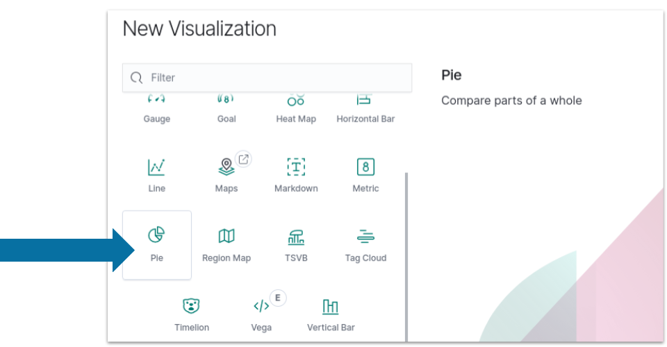
After opening the Kibana website, the following steps can be taken to make a pie chart:
-
Select the
Visualizetab from the left menu bar. -
Click the
Create a Visualizationbutton. -
Select the
Pie chart.
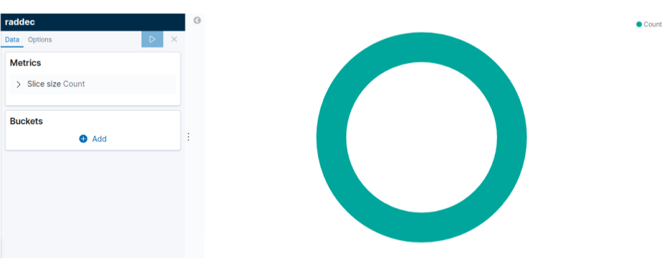
You will get a basic pie chart like this:
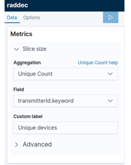
Next, in the pie chart editor, use the matrices as shown below:
-
Click to expand the Slice Size.
-
Select Unique Count from the Aggregation pull-down.
-
Select
transmitterId.keywordfrom the Field pull-down. -
Enter a label in the Custom Label field.
-
Click the right arrow on the top of the toolbar to update the changes.
Adjust buckets
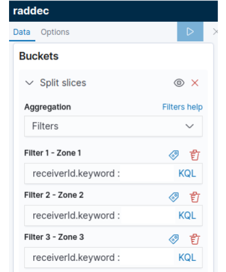
Once you’ve done this, adjust the buckets using the following steps:
-
Click to expand the Split Slices buckets.
-
Select Filters aggregation from the pull-down.
-
Each filter will collect all documents that match its associated zone. Customize the filter by adding
receiverId.keyword(s), an RSSI threshold, a Type filter, etc. -
Define a Label to specify the zone by clicking the icon.
-
Click the right arrow on the top of the toolbar to update changes.
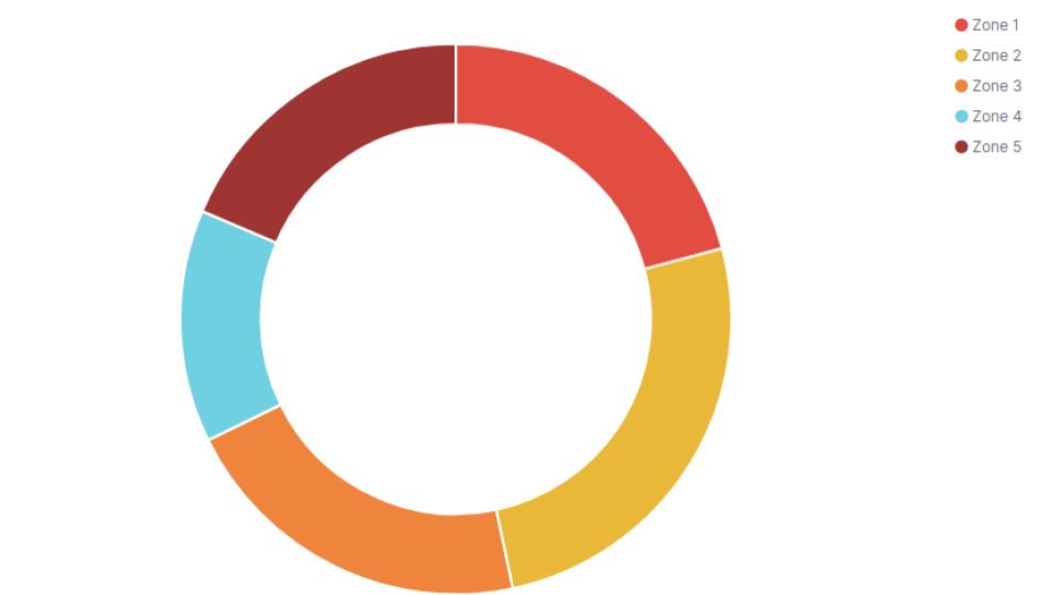
After this, the pie chart will look like:
The color of the pie chart can be changed by clicking directly on the color of each slice on the right side of the chart.
Then, to get information, follow the steps below.
Open Options tab and:
-
Check the Show Label box from the Label settings.
-
Click the right arrow on the top of the toolbar to update changes.
