How to draw a simple bar plot in R
What is a bar plot?
A bar plot is a way to visualize data in the form of rectangular bars.
Syntax of barplot
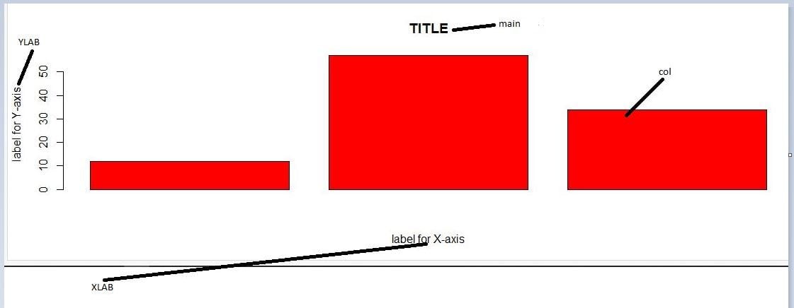
barplot(vector_or_matrix_name,xlab, ylab, main, names.arg, col)
xlab: the label of the x-axis.ylab: the label of the y-axis.main: the title of the chart.names.arg: the names that appear beneath each bar.col: the color of each bar.
Code
Suppose there is a data set that consists of the number of cars repaired by a car mechanic per month:
12,10,15,25,8,20,13,24,10,19,13,20
cars_repaired<-c(12,10,15,25,8,20,13,24,10,19,13,20)
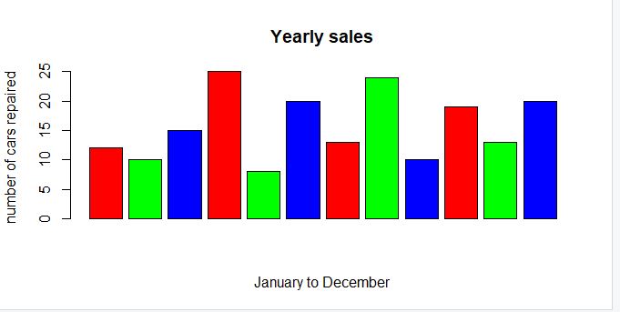
barplot(cars_repaired, xlab = "January to December" , ylab= "number of cars repaired ", main="Yearly sales", col=rainbow(3))
Expected output
When there is only one vector/matrix, the default Y-axis is displayed.
The rainbow() function is used to display the colors of a rainbow.
Now, let’s try to draw the same bar plot with the same dataset horizontally:
cars_repaired<-c(12,10,15,25,8,20,13,24,10,19,13,20)
barplot(cars_repaired, xlab = "January to December" , ylab= "number of cars repaired ", main="Yearly sales",horiz = TRUE, col=rainbow(3))
Expected output
As you can see in the illustration above, horiz = TRUE makes the bar plot horizontal.
TRENDING TOPICS


