How to transform an SVG into a React Component with SVGR
SVGs (Scalable Vector Graphics) are XML-based vector images used to define 2D graphics. An SVG file has the .svg file extension.
SVGs are used in websites/webpages to integrate 2D graphics into HTML seamlessly. Recently,
In this post, we‘ll convert SVGs to React components using SVGR.
We will then publish them, as independent components, to Bit.dev, a cloud component hub, and make them available for all our projects.
Why convert SVGs into React components?
- SVG-to-React component conversion shaves off some excess SVG styling and helps with size reduction.
- The browser makes no extra requests to fetch SVG images since they are now bundled with the JS.
- It allows for easier control and maintenance of SVGs since they are now React components.
- Verbose and obscure SVGs can be converted to customizable React components that expose a simple declarative API.
SVG and React
A common example of an SVG being used in React is none other than the famous logo.svg generated by create-react-app when scaffolding a new React project.
- react-prj/
    -src/
        - logo.svg
        ...
    ...
    - package.json
The logo.svg is the React logo:
<svg xmlns="http://www.w3.org/2000/svg" viewBox="0 0 841.9 595.3">
    <g fill="#61DAFB">
        <path d="M666.3 296.5c0-32.5-40.7-63.3-103.1-82.4 14.4-63.6 8-114.2-20.2-130.4-6.5-3.8-14.1-5.6-22.4-5.6v22.3c4.6 0 8.3.9 11.4 2.6 13.6 7.8 19.5 37.5 14.9 75.7-1.1 9.4-2.9 19.3-5.1 29.4-19.6-4.8-41-8.5-63.5-10.9-13.5-18.5-27.5-35.3-41.6-50 32.6-30.3 63.2-46.9 84-46.9V78c-27.5 0-63.5 19.6-99.9 53.6-36.4-33.8-72.4-53.2-99.9-53.2v22.3c20.7 0 51.4 16.5 84 46.6-14 14.7-28 31.4-41.3 49.9-22.6 2.4-44 6.1-63.6 11-2.3-10-4-19.7-5.2-29-4.7-38.2 1.1-67.9 14.6-75.8 3-1.8 6.9-2.6 11.5-2.6V78.5c-8.4 0-16 1.8-22.6 5.6-28.1 16.2-34.4 66.7-19.9 130.1-62.2 19.2-102.7 49.9-102.7 82.3 0 32.5 40.7 63.3 103.1 82.4-14.4 63.6-8 114.2 20.2 130.4 6.5 3.8 14.1 5.6 22.5 5.6 27.5 0 63.5-19.6 99.9-53.6 36.4 33.8 72.4 53.2 99.9 53.2 8.4 0 16-1.8 22.6-5.6 28.1-16.2 34.4-66.7 19.9-130.1 62-19.1 102.5-49.9 102.5-82.3zm-130.2-66.7c-3.7 12.9-8.3 26.2-13.5 39.5-4.1-8-8.4-16-13.1-24-4.6-8-9.5-15.8-14.4-23.4 14.2 2.1 27.9 4.7 41 7.9zm-45.8 106.5c-7.8 13.5-15.8 26.3-24.1 38.2-14.9 1.3-30 2-45.2 2-15.1 0-30.2-.7-45-1.9-8.3-11.9-16.4-24.6-24.2-38-7.6-13.1-14.5-26.4-20.8-39.8 6.2-13.4 13.2-26.8 20.7-39.9 7.8-13.5 15.8-26.3 24.1-38.2 14.9-1.3 30-2 45.2-2 15.1 0 30.2.7 45 1.9 8.3 11.9 16.4 24.6 24.2 38 7.6 13.1 14.5 26.4 20.8 39.8-6.3 13.4-13.2 26.8-20.7 39.9zm32.3-13c5.4 13.4 10 26.8 13.8 39.8-13.1 3.2-26.9 5.9-41.2 8 4.9-7.7 9.8-15.6 14.4-23.7 4.6-8 8.9-16.1 13-24.1zM421.2 430c-9.3-9.6-18.6-20.3-27.8-32 9 .4 18.2.7 27.5.7 9.4 0 18.7-.2 27.8-.7-9 11.7-18.3 22.4-27.5 32zm-74.4-58.9c-14.2-2.1-27.9-4.7-41-7.9 3.7-12.9 8.3-26.2 13.5-39.5 4.1 8 8.4 16 13.1 24 4.7 8 9.5 15.8 14.4 23.4zM420.7 163c9.3 9.6 18.6 20.3 27.8 32-9-.4-18.2-.7-27.5-.7-9.4 0-18.7.2-27.8.7 9-11.7 18.3-22.4 27.5-32zm-74 58.9c-4.9 7.7-9.8 15.6-14.4 23.7-4.6 8-8.9 16-13 24-5.4-13.4-10-26.8-13.8-39.8 13.1-3.1 26.9-5.8 41.2-7.9zm-90.5 125.2c-35.4-15.1-58.3-34.9-58.3-50.6 0-15.7 22.9-35.6 58.3-50.6 8.6-3.7 18-7 27.7-10.1 5.7 19.6 13.2 40 22.5 60.9-9.2 20.8-16.6 41.1-22.2 60.6-9.9-3.1-19.3-6.5-28-10.2zM310 490c-13.6-7.8-19.5-37.5-14.9-75.7 1.1-9.4 2.9-19.3 5.1-29.4 19.6 4.8 41 8.5 63.5 10.9 13.5 18.5 27.5 35.3 41.6 50-32.6 30.3-63.2 46.9-84 46.9-4.5-.1-8.3-1-11.3-2.7zm237.2-76.2c4.7 38.2-1.1 67.9-14.6 75.8-3 1.8-6.9 2.6-11.5 2.6-20.7 0-51.4-16.5-84-46.6 14-14.7 28-31.4 41.3-49.9 22.6-2.4 44-6.1 63.6-11 2.3 10.1 4.1 19.8 5.2 29.1zm38.5-66.7c-8.6 3.7-18 7-27.7 10.1-5.7-19.6-13.2-40-22.5-60.9 9.2-20.8 16.6-41.1 22.2-60.6 9.9 3.1 19.3 6.5 28.1 10.2 35.4 15.1 58.3 34.9 58.3 50.6-.1 15.7-23 35.6-58.4 50.6zM320.8 78.4z"/>
        <circle cx="420.9" cy="296.5" r="45.7"/>
        <path d="M520.5 78.1z"/>
    </g>
</svg>
Converting an SVG to a React component simply means creating a React component that renders an SVG. This does away with having extra .svg files lying around.
For example, we can create a React component that returns the React logo.svg XML:
class ReactLogo extends React.Component {
    render() {
        return (
            <svg xmlns="http://www.w3.org/2000/svg" viewBox="0 0 841.9 595.3">
                <g fill="#61DAFB">
                    <path d="M666.3 ... 50.6zM320.8 78.4z"/>
                    <circle cx="420.9" cy="296.5" r="45.7"/>
                    <path d="M520.5 78.1z"/>
                </g>
            </svg>
        )
    }
}
Then we can use it anywhere:
class App extends Component {
  render() {
    return (
      <div className="App">
        <header className="App-header">
          <ReactLogo />
          <p>
            Edit <code>src/App.js</code> and save to reload.
          </p>
          <a className="App-link" href="https://reactjs.org">
            Learn React
          </a>
        </header>
      </div>
    );
  }
}
There is no <img src={logo} className="App-logo" alt="logo" />; it’s been replaced with <ReactLogo />. There will also be no need of logo.svg because everything is in the ReactLogo component.
Here, we manually converted the React icon SVG into a React component, but we can save ourselves some time by using SVGR to automate this process.
Using SVGR in the command line
To use SVGR from the command line, install the CLI tool:
npm install @svgr/CLI
Then, we call SVGR in the command-line, passing in the .svg file and other flags to replace different attributes with our own values.
svgr --icon --replace-attr-values "#063855=currentColor" logo.svg
The above command will take our logo.svg file and convert it to a React component.
We can then copy the output shown in our terminal and create a new Logo.jsx component.
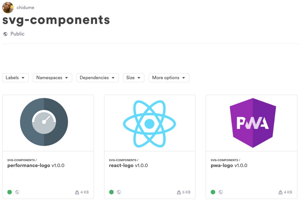
Publish converted components to Bit.dev

Now that we have our logo.svg file as a React component Logo.jsx, we can publish it to our collection on Bit. This way, we’ll make it available for our team to use in other projects.
Let’s install Bit globally on our machine:
$ npm install bit-bin --global
We’ll now initialize a Bit workspace in our project’s root directory:
$ cd svg-icons-project
$ bit init
We can add multiple components at once, but for this small demo, we’ll specifically pick our Logo component:
$ bit add src/Logo.jsx
Now, since it is a React component, we’ll need to configure a compiler for it. > Otherwise, it would be coupled to our project’s build setup, and we don’t want that. We want our published components to move freely from one project to another.
The compiler is another component published on Bit. The --compiler flag is our way of mentioning that it should be used as a compiler.
$ bit import bit.envs/compilers/react --compiler
We’ll now tag our component with a version number:
$ bit add --all 1.0.0
Login to our account (via our terminal):
$ bit login
Finally, publish (‘export’) our component to the collection we’ve created on Bit.dev:
$ bit export chidume.svg-components
I’ve published another two converted components. Feel free to visit my component collection.
Alternative ways to use SVGR: Node and Webpack
Webpack
To use from Webpack, first install this:
npm install @svgr/webpack
This is a Webpack loader. We will config the webpack.config.js with it.
// webpack.config.js
module.exports = {
  module: {
    rules: [
      {
        test: /\.svg$/,
        use: ['babel-loader', '@svgr/webpack']
      }
    ]
  }
}
We can then add SVGs to our components and upon compilation/bundling, Webpack will transform them to React components using SVGR.
Node
To use SVGR in Node.js, we will have to install the module first:
npm install @svgr/core
Next, we import svgr from the @svgr/core:
import svgr from '@svgr/core'
// svg code for "X"
const svg = `
  <svg width="88px" height="88px" viewBox="0 0 88 88">
    <title>Dismiss</title>
    <desc>Created with Sketch.</desc>
    <defs></defs>
    <g id="Blocks" stroke="none" stroke-width="1" fill="none" fill-rule="evenodd" >
        <g id="Dismiss" stroke="#063855" stroke-width="2">
            <path d="M51,37 L37,51" id="Shape"></path>
            <path d="M51,51 L37,37" id="Shape"></path>
        </g>
    </g>
  </svg>
`
svgr(svg, { componentName: 'LogoXComponent' }).then( component => {
  // ...
} )
SVGR playground
You can use SVGR from their online playground.
There, you can pour in your SVG code in one box at the left and see it converted to a React component in another box at the right, adjacent to the box containing the SVG code.
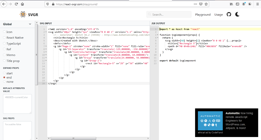
All the options we use in the command line are always there for you. You can use the checkboxes to turn an option on or off. You also have text boxes to type in your configuration.
It’s awesome.
Free Resources
- undefined by undefined
