What is a burndown chart?
Managers in major firms around the world know that there are time management issues around task completion. It is always useful to have consistent data regarding time constraints and work left to make sure that tasks are completed on time.
Burndown charts
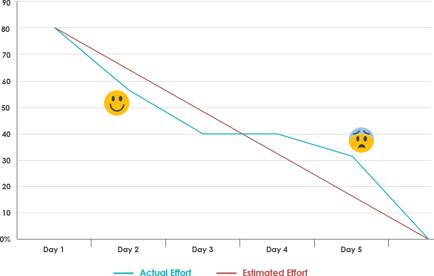
It is vital to communicate the correlation between the number of tasks to be completed and the time there is to complete them. A Burndown Chart provides a graphical representation of how much work is left and the amount of time left to do it. The chart corresponds to a simple graph that has remaining work plotted on the y-axis and time passed plotted on the x-axis. This can be viewed by everyone on the team, so it is important to update it regularly to familiarize them with the progress of the tasks.
Estimated effort line
A straight-line from start to finish that is mainly based on estimate data and represents how work should ideally be taking place. It does not take into account any external factors.
Note: When the line reaches the x-axis it means the work has been completed.
Actual effort Line
The Actual Effort Line shows how work has been progressing in reality and how much is left to complete. The line is updated every day, therefore, there will always be fluctuations of the actual effort line that are above and below the estimated effort lines.
If the Actual Effort Line is below the Estimated Effort Line, it means the task is ahead of schedule. This can be illustrated by a smiley face on the graph. However, if the Actual Effort Line is above the Estimated Effort Line, it means the task is behind schedule. This can be represented by a frightened emoticon on the graph.
Applications of a burndown chart
- It provides a graphical representation of the updated status of the task at hand.
- It is available for everyone to view, which ensures participation of everyone inside the company regardless of rank.
- The Estimated Effort Line helps employees to identify the pace of the task completion and encourages them to deal with these issues before they cause major concerns.
Free Resources

