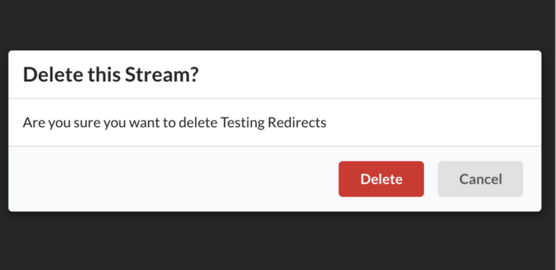
What is a React modal?
A modal is a message box that is displayed on top of your screen. Modals put an overlay on the screen; therefore, they take visual precedence over all the other elements.
Implementing a simple modal
Let’s try to implement a very basic wireframe of a modal that includes a button to open the modal, the modal itself, and a button to close the modal.
Here’s a summary of the steps required:
-
Create a
Maincomponent which holds astateandopenbutton. -
Create a
Modalcomponent which renders the children components passed to it and holds aclosebutton. -
Display the
Modalcomponent upon clickingopen. -
Close the
Modalcomponent upon clickingclose.
Code
Let’s start with a basic Main component. See the code below:
import React, { Component } from "react";import ReactDOM from "react-dom";class Dashboard extends Component {state = { show: false };showModal = () => {this.setState({ show: true });};hideModal = () => {this.setState({ show: false });};render() {return (<main><h1>React Modal</h1><button type="button" onClick={this.showModal}>open</button></main>);}}const container = document.createElement("div");document.body.appendChild(container);ReactDOM.render(<Dashboard />, container);
So far, there is a simple Main component which has a show state. This state is toggle-able via the showModal and hideModal class properties – each property will have its own button. In the example above, the Main button’s onClick handler will set state.show to true.
Code
Let’s move on to the Modal component; see the code below:
const Modal = ({ handleClose, show, children }) => {const showHideClassName = show ? "modal display-block" : "modal display-none";return (<div className={showHideClassname}><section className="modal-main">{children}<button onClick={handleClose}>close</button></section></div>);};
The Modal component receives handleClose, show, and children as props passed down to it from Main. There’s a showHideClassName variable which displays or hides the Modal after looking up the value of state.show.
If
showis true, the top-level div will have ashowHideClassnameofmodal display-block; otherwise, it will bemodal display-none.
The close button is also being passed down as a child of Modal; the button has the onClick handler of handleClose which will set state.show in Main to false.
Code
After putting everything together and incorporating the basic CSS, here’s what the code looks like:
import React from 'react';
require('./style.css');

import ReactDOM from 'react-dom';

class App extends React.Component {
  state = { show: false };

  showModal = () => {
    this.setState({ show: true });
  };

  hideModal = () => {
    this.setState({ show: false });
  };

  render() {
    return (
      <main>
        <h1>React Modal</h1>
        <Modal show={this.state.show} handleClose={this.hideModal}>
          <p>Modal</p>
          <p>Data</p>
        </Modal>
        <button type="button" onClick={this.showModal}>
          Open
        </button>
      </main>
    );
  }
}

const Modal = ({ handleClose, show, children }) => {
  const showHideClassName = show ? "modal display-block" : "modal display-none";

  return (
    <div className={showHideClassName}>
      <section className="modal-main">
        {children}
        <button onClick={handleClose}>Close</button>
      </section>
    </div>
  );
};

const container = document.createElement("div");
document.body.appendChild(container);
ReactDOM.render(<App />, container);
Free Resources


