What is block content in Ember js?
When using Ember, content templates allow us to leave placeholders for separate HTML. These are called blocks.
Through the block content, we can add additional styling using the HTML that is passed into the component.
This allows the page to be much more dynamic.
Example
Let’s consider a normal component; nothing out of the ordinary. Our template may look something like this:
<section>
  <div>
    {{yield}}
    <button {{action "someAction"}}>Submit</button>
  </div>
</section>
The above template shows a {{yield}} block where users can put any content they want. We can use it like this:
{{#some-component}}
  <p>Hello!</p>
{{/some-component}}
The <p> tag with “Hello!” will appear in the yield block.
Conditional blocks
We can also provide default content in case the user has not provided a block. This can be achieved using (has-block).
<dialog>
  {{#if (has-block)}}
    {{yield}}
  {{else}}
    Whoops! No block content defined
  {{/if}}
</dialog>
If the component is rendered without a block, the default message is displayed.
Block parameters
Similar to callback functions in JavaScript, we can also use blocks to pass values back into the template.
We can also yield back multiple values. Let’s consider an example.
Suppose we create a component with the name some-comp. The component template file (some-comp.hbs) looks something like this:
{{#some-comp planet = model.planet as |value|}}
   <h2>{{ value }}</h2>
{{/some-comp}}
{{outlet}}
We can further assume that a .js file exists that defines a model with an array, planet, which contains a list of planets.
The some-comp.hbs file under app/templates/components/ looks like this:
<h2>Some Planets:</h2>
<!--template iterates an array named 'planet'-->
{{#each planet as |value|}}   <!--//each item in an array provided as block param 'value'-->
   {{ yield value }}
{{/each}}
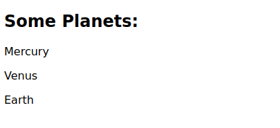
Running the ember server generates the following output:
Output
Summing up
{{yield}} acts as a placeholder with block-style components.
<MyComponent>
<!--some markup-->
</MyComponent>
In our my-component.hbs file, wherever we write {{yield}} is where the markup passed into the component (“some markup”) is rendered.
Note:
{{outlet}}is the placeholder for a child component’s markup.
Free Resources
