CSS interview questions: Cheat sheet for front-end interviews
Front-end interviews are not the easiest. How do you prepare? Where do you start? There is a wide range of questions that may be asked during a front-end interview. These will certainly include questions about your experience and familiarity with CSS, one of the basic building blocks of the any web page.
Today, I will help you prepare for CSS questions during a front-end interview. This article provides a refresher on CSS concepts as well as common interview questions. This is for anyone preparing to take a front-end interview. There are also some example challenges with solutions and their explanations for each topic.
Today, we will cover:
- CSS Basics Refresher
- CSS Selectors and Specificity
- CSS Text, Color, Fonts
- CSS Float Property
- CSS Flexbox
- Advanced CSS questions
- What to learn next
Succeed in your front-end interview.
Cover a comprehensive range of CSS questions that you are likely to be tested on during front-end interviews.
CSS Basics Refresher#
CSS is extensive, and the questions asked in front-end interviews can be very wide-ranging - from basic styling to advanced concepts like pseudo-elements and pseudo-selectors. So, it’s important to refresh even the most basic questions of CSS. Let’s dive in.
What is CSS?#
CSS stands for Cascading Style Sheet. CSS is a programming language determines the style of the content any HTML webpage.
What is the difference between CSS2 and CSS3?#
There are four main differences:
-
CSS3 modules are supported by almost every browser, but CSS2 is not.
-
CSS3 is divided into two sections called modules. In CSS2, everything is featured on a single document with all the information in it.
-
With CSS3, you can use multiple background with the following properties:
background-image,background-repeat styles, andbackground-position. -
CSS3 introduced graphics not available in CSS2, such Flexbox, Border-radius, and box-shadow.
What are the modules used in the current version of CSS?#
- Selectors
- Backgrounds and borders
- Box Models
- Animations
- Multiple column layout
- Text font and color
- 2D/3D Transformations
- User Interface (UI)
How can you integrate CSS into a HTML page?#
There are three popular ways to integrate CSS:
- Use
inline-styling - Use
style-tagsin the header of an HTML page - Write CSS as a separate file and add it to an HTML page with a
linktag
What are the advantages and disadvantages of CSS?#
The following are the primary advantages of CSS:
- You can control the style of multiple documents using a single CSS page
- Multiple HTML elements can have many documents
- You can group styles for complex situations using the grouping method
The following are the primary disadvantages of CSS:
- Can limit vertical control
- No column declaration or expression
- You cannot ascend by selectors
What are the primary CSS libraries used today?#
- Bootstrap: the most popular library for mobile-first websites
- Semantic UI: a modern front-end framework powered by LESS and jQuery
- Foundation: a front-end framework with a responsive grid, CSS UI components, and templates
- Ulkit: a lightweight, modular front-end framework for building web interfaces
What is a CSS preprocessor?#
A CSS preprocessor is a program that uses its own syntax for writing CSS. They make CSS more readable. These extend CSS and add other features, such as a nesting selector, mixins, and inheritance selector. A popular CSS preprocessor is SASS.
CSS Selectors and Specificity#
Now that we’ve refreshed the basics of CSS, let’s move onto intermediate questions about selectors and specificity. You can expect interview questions on these topics, as they are the foundations of CSS overall.
What is a CSS selector, and how do you use it?#
CSS selectors define the elements to which a set of CSS rules apply. CSS rules are applied to an element based on a relevance factor. This is termed Specificity, and it is how a browser decides which CSS property values will be applied to an element.
Basic Selectors include type, class and id selectors. Examples of Combinator Selectors include the descendant combinator, which selects nodes that are descendants of the first element (A B), and the child combinator (A > B), which selects nodes that are direct children of the first element. Selectors can be grouped by separating rules with a comma ,.
What is specificity in CSS?#
Specificity is how a browser decides which CSS property values are most relevant to an element. This is how a browser selects which values to apply. Specificity is based on matching rules. In other words, specificity is the weight of any CSS declaration.
If multiple declarations share a specificity, the last declaration is applied. Elements that are directly targeted take precedence over elements that are inherited from parents or ancestors.
How does a browser determine which elements match a CSS selector?#
Browsers will match selectors from the rightmost to left. Browsers filter out elements according to the key selector. They will traverse up the parent elements. A browser determines matches quicker if a selector chain is shorter.
Now, let’s look at a challenge question on CSS Selectors and Specificity that you can expect in an interview.
CSS Selectors Challenge#
The challenge: You will need to add CSS combinators in the given HTML so that the output looks like the image below. The HTML is in a read-only state to make it more challenging. The colors used are yellow, black, and orange. The border and padding are 10px and 30px.
Using the code environment below, try it out yourself before checking the solution.
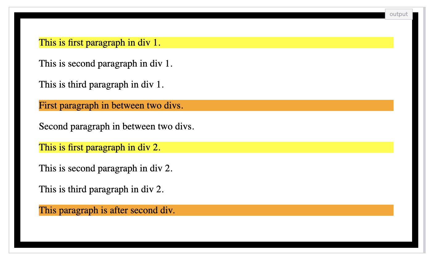
Solution review: CSS selectors challenge
Here, we’re using the border property to add a solid border around the body. The border color is black and 10px thick. The padding property adds spacing (30px) between the edge of the border and the edge of the content area on all sides.
> is a direct child selector. In this case, we use it in combination with :first-of-type to select the first paragraph and set the background to yellow. Finally, we select all paragraphs that are the adjacent siblings of a div and set their background to orange.
CSS Text, Color, Fonts#
CSS is most commonly used to manipulate text, including placement, color, and font. You can expect questions and coding challenges that deal with text manipulation in a front-end interview.
How many ways can we change the color of our text?#
We can change color in four ways.
// Color name
p {
    color: red;
}

// Hex value
p {
    color: #ccc;
    color: #cccccc;
}

// RGB value
p {
    color: rgb(129, 176, 78);
}

// HSL value
p {
    color: hsl(130, 90%, 40%);
}
What are CSS gradients?#
Gradients in CSS allows us to create a smooth transformation between two or more colors. There are two types of gradients we can use in CSS: Linear Gradient and Radial Gradient.
How would you set a h2 and h3 to have the same styling?#
You can set multiple elements with the same style by separating items with a comma (,). For example:
h2, h3 {

color: yellow;

}
What is the default font size used for all CSS elements?#
16px is the default size.
What are the different units used in CSS?#
In CSS, length is a number followed by a length unit. CSS has two types of lengths with different units for expressing them: relative length and absolute length. The relative units are as follows:em, ex, ch, rem, vw, vh, vmin, vmax, and %. Abolsute units are as follows: cm, mm, in, px, pt, and pc.
How would you add Google fonts to a webpage?#
The <link> tag is used to add google fonts in the head section of the html page. The syntax looks similar to:
<link href="https://fonts.googleapis.com/css2?family=Balsamiq+Sans&display=swap" rel="stylesheet">
font-family: 'Balsamiq Sans', cursive;
Now let’s try our hand at a CSS text color challenge. Try the solution yourself before checking the answer.
CSS text color Challenge#
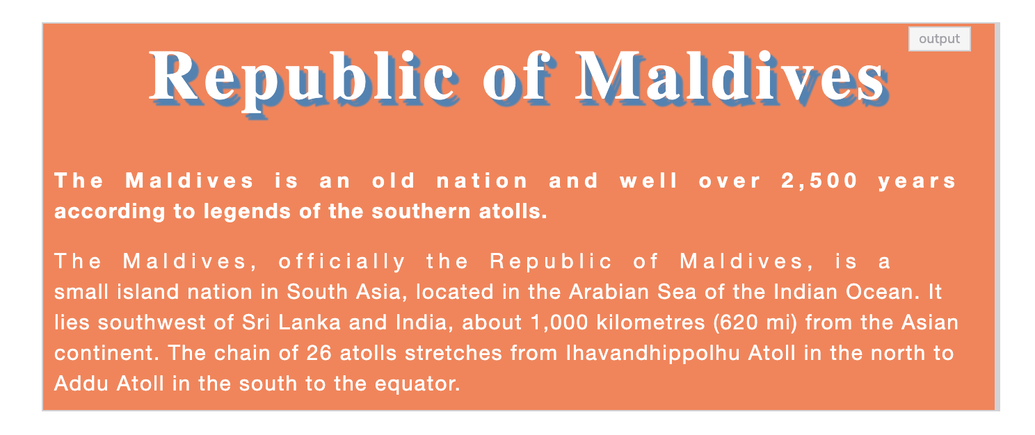
The challenge: The colors used in the challenge are steelblue and coral. Set the font size of the root element (html) to 10px. The font family for paragraphs is Helvetica Neue. Here is your output goal:
Solution Review: CSS Text Color Challenge
We have assigned the 10 pixels font-size to our HTML tag, which is the root element of our page. We have set coral as the background-color to our body tag.
The text color for the h1 tag is set to white. The font-size is increased to 5rem (1 rem = 1 x root element pixels) so that 5rem is equal to 50 pixels. In text-shadow: 5px 5px 1px steelblue, 3px 3px 1px steelblue;, the 5px 5px 1px steelblue is the horizontal shadow, and 3px 3px 1px steelblue is vertical shadow value where 1px is blur-radius. The text is aligned in the center. The spacing between each letter is 4 pixels.
The first paragraph is selected, and the font-weight is set to bold using the adjacent sibling selector. The spacing between letters is 4 pixels, and the spacing between words is also 4 pixels for the first lines of the paragraphs using the ::first-line pseudo-element selector.
The font-size of the paragraphs is set 1.5rem (15 pixels). The text color is set to white. The font-family: Helvetica Neue is used for the paragraphs. The space between each line is set to 1.5 (15 pixels). The spacing between letters is set to 1 pixel.
CSS Float Property#
Questions about the float CSS property are common in interviews. These fall into the intermediate level of CSS questions. Let’s take a look at some notable interview questions for float and attempt a challenge to apply the concepts.
What is the float property in CSS?#
The float property is used to place an element on the left or right side of a container. This allows text to wrap around an object while removing it from the normal flow of the page. There are three uses for float: float: none, float: left, and float: right.
What is the default value used for the float property?#
None is the default value for float property. This ensures the element will not float. To set an element to the left or right, we must speficy that style.
Which float value will adopt the float property of its parent?#
If we set float: inherit; on an element, it will inherit the value of float property from its parent element.
How do we control the behavior of floating elements?#
We must use the clear property. If we don’t add a clear property, the elements will clutter up the existing floating elements. For example, we want 3 <p> tags to float on right side of the page with width: 30%;, we must write:
p {
    border: 2px solid coral;
  float: right;
  width: 30%;
  clear: both;
}
Now let’s attempt a challenge to quiz our knowledge of the CSS float property. Try writing the code yourself before checking the solution.
Crack the front-end interview and master CSS.#
This course compiles a comprehensive range of questions that you are most likely to be tested on during front-end interviews. Explore more than 200 CSS coding challenges and multiple-choice questions. By the end of this course, you will have gained the confidence to go in and answer any CSS question.
CSS Float Challenge#
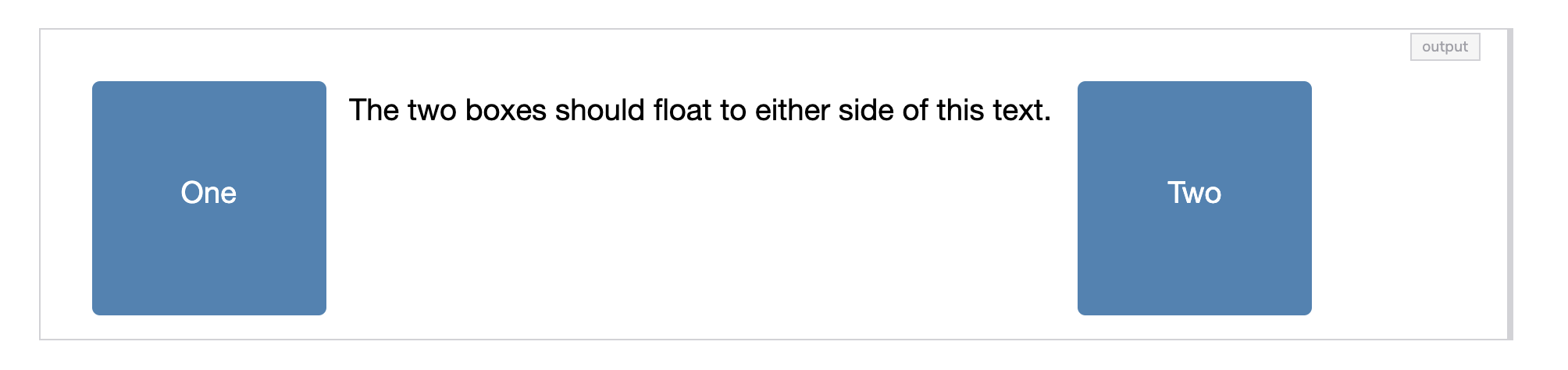
The challenge: Add relevant float properties to the given divs so that the text appears between the two boxes as in the image below. The color used in this challenge is steelblue. The width and height of the boxes are 150px.
Solution Review: CSS Floats
First, we style the text by setting the font-size, font-family, and line-height properties. All the elements must have a border-box around them so that the padding and border are included in an element’s total width and height.
Next, we set the width of the outer div to 90%, and we add a padding of 0.5em along all the sides of the box. Then we make the boxes appear to be squares with rounded edges by setting the border-radius to 5px and giving them a width and height of 150px. Finally we set the text’s color to white.
We also give the background color the value steelblue as was stated in the challenge instructions. To help with the text alignment, we set the padding-top property to 3em. This pushes the text downwards.
CSS Flexbox#
In the CSS specification, Flexbox is described as a layout model for user interface design. The key feature of Flexbox is that items in a flex layout can grow and shrink. Space can be assigned to the items themselves or distributed between or around the items. You can expect questions on the CSS Flexbox, as it is a main addition to CSS3.
What is CSS flexbox?#
The flexbox layout is a new layout module of CSS3. It can be used to improve item alignment, directions, and organization within a container. It can be applied to dynamic items.
What are all the properties of the CSS flexbox?#
There are six properties of the flexbox in CSS3:
flex-directionflex-wrapjustify-contentalign-itemsflex-flowalign-content
In which direction are the flex-container elements aligned by default?#
All the items are aligned horizontally when we declare display: flex;.
What does the CSS syntax flex: 1 do?#
This syntax will distribute equal widths among flex-items.
Say there are multiple flex containers, and you want to align them. Which of the following properties is used?#
The align-content property is used to align multiple flex containers.
Now let’s try a CSS flexbox challenge to test our skills. Try the answer yourself before checking the solution.
CSS Flexbox Challenge#
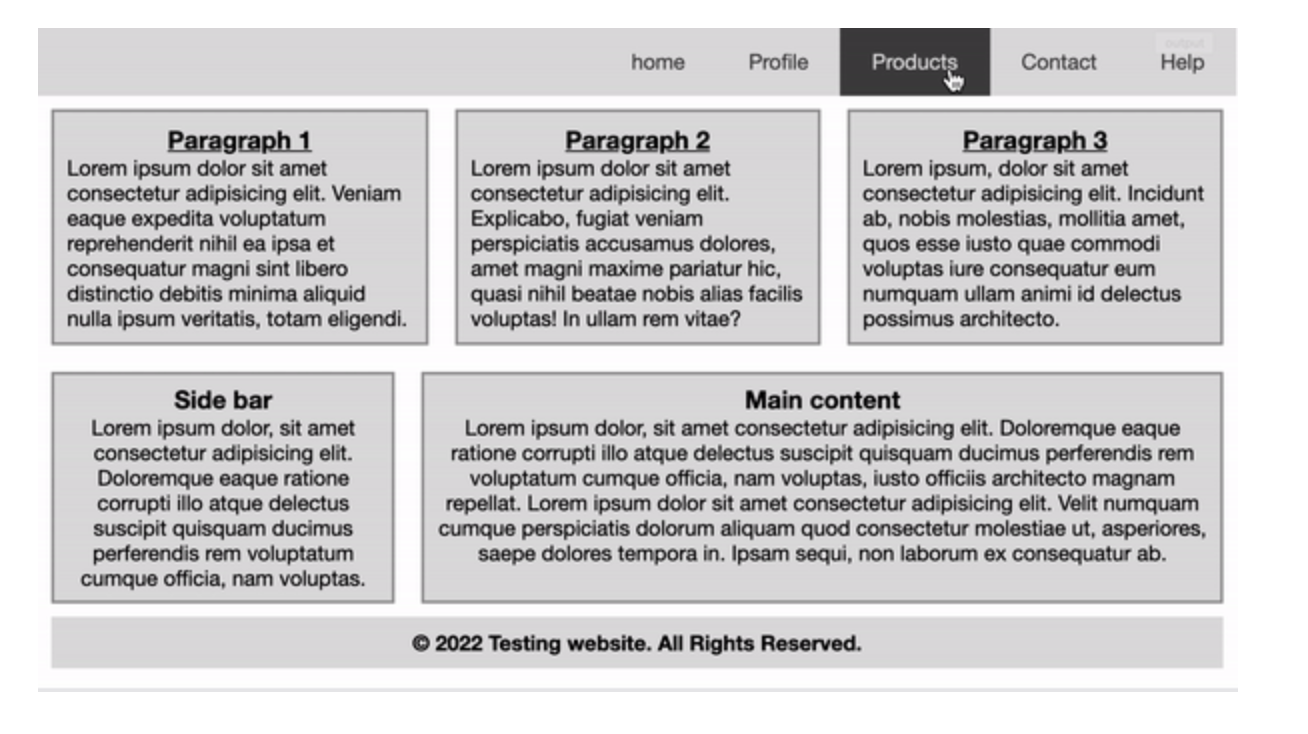
The challenge: Create a mini-website that, when hovering over the navigation bar items, changes background colors. The HTML structure is already given in the widget. You will need to write the code in the CSS tab.
The height of the output window is 500 pixels and colors used are #ddd and #444. Use #666 for the borders. The font family used in this challenge is Helvetica Neue. Use the flexbox properties in the given challenge so that your output looks like the following image:
Solution Review: CSS Flexbox
The first thing we do here is set the box-sizing property for all elements on the page so that the padding and border are included in each element’s total width and height. We are also going to remove the border and padding around the elements as this gives us room to add our custom values.
Remember that you have to add display: flex; to an element in order to give it the Flexbox layout properties. Our navbar now has the Flexbox layout applied, and the background-color is set to #ddd. We use the justify-content property to align the flex items at the end (right side).
Next, we style the anchor tags by setting the font-family, color , and text-align properties, and removing the default underline decoration. On hover, we also change the background-color to #444, and the text color to #ddd. We apply a padding of 1rem on the top and bottom, and 1.5rem is applied on the left and right of each anchor tag.
Now we move on to styling the sections. In #maincontent, we have a margin and padding of 10px on each side with a 2px solid dark grey border and very light gray background (background-color: #ddd). The h3 in all sections are aligned in the center and have an underline.
The sidebar and menu are displayed as flexboxes by using display: flex; for the main-area div. They both have a margin and padding of 10 pixels and 0.5rem on each side with a 2px solid #999 border. The background color is set to #ddd.
The width of the sidebar and menu is set to 30% using the flex-basis property. We’ve set the text-alignment for all flex items to ‘center’.
The footer has a margin of 10 pixels on each side and a padding of 10 pixels on the left and right side only because the main-area flex items already have a margin of 10 pixels. We’ve made the text bold using the font-weight property.
For the final challenge requirement, on screen sizes less than 500 pixels, we change the default direction of flex items to column. Doing this makes each item take the full width available. The sidebar and menu also have to take full width so we added flex-basis: 100%;.
Otherwise, they would respectively take 30% and 70% widths. Finally, we added a 1px solid white border around each anchor tag to differentiate them.
Advanced CSS questions#
Now that we’ve covered the basics of CSS and intermediate questions, let’s take a look at some advanced questions you can expect in a CSS front-end interview. We won’t be going into all of these questions today, but I want to give you an overview of the advanced topics you’ll need to master to crack the front-end interview.
CSS pseudo selectors#
- What are pseudo-elements in CSS?
- Suppose there are 15 items in the list and you want to style the 9th item listed. What is the syntax used for it?
- How would you choose the 3rd last element in the list of 10 items?
- Explain the concept of pseudo-elements in CSS.
- Is it possible to use multiple pseudo-class selectors with an element?
- What will happen if you don’t mention the element name before the
:hoverpseudo selector?
Block Formatting Context (BFC)#
- What is a block formatting context?
- How do you create a block formatting context using the
displayproperty - Which
positionvalue is added to adivto create a block formatting context? - Which float value does not create a block formatting context when added to a
div?
Clearing Techniques#
- How do you use empty div with
clear: both? - How do you use the
overflowmethod? - How do you use the
clearfixtechnique? - How do you use
display: flow-rooton a parent element?
Resetting vs. Normalizing CSS#
- Which CSS property is used to remove all the selected element’s properties?
- Why should we add
normalize.cssto our HTML document? - Why should we add a reset stylesheet to our HTML document?
General advanced questions#
- When would you use
translate()over absolute positioning? - Explain the difference between a fixed, relative, statically positioned, and absolute element.
- What are Vendor-Prefixes in CSS? When do we use them?
- Explain how CSS works under the hood.
- How would your optimize a given webpage for prints?
- Which of the following
@viewportproperties locks the document in the specified direction, portrait, or landscape? - What is the
screenmedia type used for?
What to learn next#
Congratulations! I hope that reading through this article and working on the challenges helped refresh your CSS knowledge. This cheatsheet walked you through the most common CSS questions from beginner to advanced. There is still a lot to learn! On top of what we covered today, you’ll need to gain mastery over the following CSS concepts and questions:
- CSS border and background properties
- CSS overflow concepts
- CSS Display, Position, Transform
- CSS Box-model
- Pseudo-elements and class selectors
- z-index and stacking context
- Hiding content from a reader
- Working with SVG and retina displays
- CSS best practices
If you want to try your hand on more challenges and quizzes, check out the hands-on on course CSS For Front-end Interviews. It covers all of these topics and more with interactive quizzes, 200+ coding challenges, and visual explanations. It focuses on the most fundamental concepts of the CSS language that the interviewer expects a candidate to know. By the end of this course, you will have gained the confidence to go in and answer any question.
Happy learning!
Continue reading about CSS and front-end interviews#
Free Resources
