What are color basics in UI and UX?
Color choice can determine the amount of engagement a digital product potentially receives. It is often easy to notice the color of someone’s clothes or the color used to paint a wall. This shows how easily noticeable colors can be to the viewer’s eye.
Color basics
Some color basics for interface design are delinated below.
- Color Ratio: Color ratio is a simple percentage structure that should be applied in interface design to minimize the viewer’s stress. The existence of a color ratio helps create balance and harmony and connects viewers to reality with ease. By convention, there is a 60:30:10 color ratio rule. A mild color should be 60% of the ratio, with a secondary color of 30%. Lastly, 10% of an an accent color to support the existing colors of the ratio will tie it all together.
Graphic example of the color ratio
-
Color and identity: Color consideration is very important for brand and identity. There are colors that are warm in nature and colors that are considered cool. It is very important for enterprises to consider what they represent and apply the best color that can represent their brand. Some warm colors such as red, orange, and yellow can signify excitement, importance, and demand attention. Cool colors like green, blue and purple signify tranquility. The color applied to any design should go with this understanding in order to easily connect with the target audience. Companies like Apple apply this understanding, as the color yellow signifies happiness and could be seen around the apple designs with other bright colors. This helps garner an easy connection with the users. It is important to consider this to gain easy connection and trust.
-
Color and culture: Most companies have a design for which they are known. Companies are consistent with the use of certain colors to create a subconscious association between a company and its color scheme. A drink company like Fanta makes use of a split complementary color scheme in their logo design, and most of its public appearance is known for this logo. Also, the Firefox browser makes use of split complementary color scheme in its logo design. MasterCard, a financial service company, makes use of the analogous color scheme in its logo design. This helps for easy recognition of their brands in public appearance as they stay consistent with this trend of color usage.
-
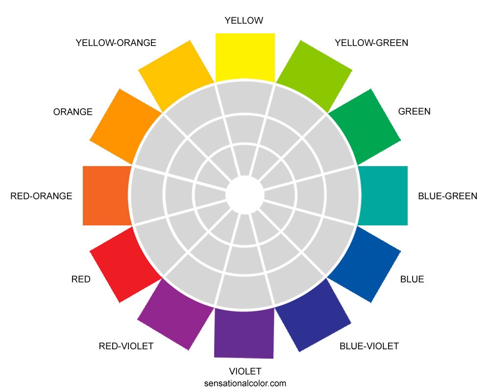
Color scheme: The color schemes are all derivatives of the color wheel. The color wheel consists of the relationship between:
- The primary colors: red, yellow, and blue.
- The secondary colors: orange, green, and violet.
- The tertiary colors: red-orange, yellow-orange, yellow-green, blue-green, blue-violet, and red-violet.
The following color scheme stems from the relationship that exist on the color wheel.
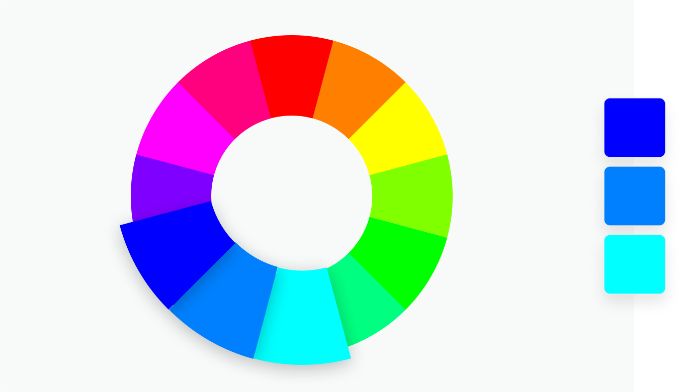
I. Monochromatic scheme: This is a scheme where one color exists in different shades/hues and is applied in design work. The example below is a monochromatic blue scheme.
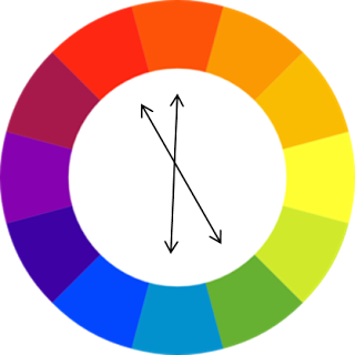
II. Complimentary scheme: This is a scheme where two directly opposite colors across the wheel are chosen for a design. Below, we have an example of a complementary color.
III. Analogous color scheme: This is a scheme where three colors are side by side on the color wheel and are selected for a design work.
IV. Triadic scheme: This is a scheme where the selected colors form a triangle across the wheel.
V. Double complementary scheme: This is a color scheme where two colors are next to each other on the color wheel and are paired with two adjacent colors on the opposite end of the wheel.
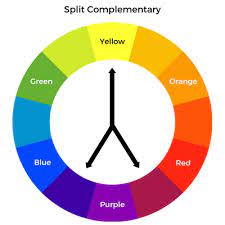
VI. Split complementary scheme: A split complementary scheme is one where colors are selected from the color wheel with one color on either side of its complementary color.
Color scheme is a major consideration in interface design. This ensures proper color combination and management in layout designs. The use of color in design is very important for all these reasons. It can boost a product’s reputation or vice versa. The use of random colors on a design interface without purpose is not common.
